Design Language and Pattern Matching in Cafes
Pre-caffeinated you’re vulnerable.
You walk into a new cafe. Laced with uncertainty you wonder if it will be any good. Will the $8 spent on this matcha latte be worth it? You step in and your blood pressure instantly lowers; this feels like a place that’s going to serve something excellent. The visual language in the cafe signals that this place is probably going to serve you an excellent drink.
Design Language
The smell, the vibe, the crowd, the menu, the equipment; conscious or not, you're judging the experience, pattern-matching against other cafe experiences ranging from the profound to the everyday.

Silhouettes of good taste and expressions of intention stand in the shadows. A Modbar sunken espresso setup, a Fellow Stagg kettle, and an EK-43 coffee grinder. The design language of the establishment expresses care: about heads-up service and connecting with guests unencumbered by a large metal box (a standard espresso machine), for steadiness, temperature precision, and flow rate of their kettle, and for a unimodal grind distribution of their coffee for better extraction.
Off the street consumers walking in inherently understands the full value proposition of these tools, and others, but they can pattern match them against other experiences in other cafes where they had a fantastic coffee. There’s consensus across the industry on brewing problems and a matching set of contemporary tools to solve them. The best equipment companies have done an excellent job constructing a visual language across their products with recognizable and tasteful design.
It was this level of intention that originally allowed specialty coffee shops to survive and thrive outside of the mold of ordinary coffee shops ranging from busy bookstore vibes to Starbucks style cafes.
The Dark Side of Pattern Matching
More and more, the best cafe experiences have a predictable aesthetic. It makes it easy to determine if a cafe will be any good. It almost feels as if we’re in a golden era of specialty cafes around every corner. But at what point do these symbols of quality cross into hollow vanity? Can you just buy your way into being cool?
Pattern matching is getting harder. The design language and aesthetic which reliably distinguishes good cafes from bad has been hijacked. The algorithms that feed us on platforms can influence and homogenize our taste and influence cafe design. As reported in the Verge
"the coffee roaster Four Barrel in San Francisco looks like the Australian Toby’s Estate in Brooklyn looks like The Coffee Collective in Copenhagen looks like Bear Pond Espresso in Tokyo. You can get a dry cortado with perfect latte art at any of them, then Instagram it on a marble countertop and further spread the aesthetic to your followers."
Cafes, good or bad, can employ similar aesthetic principles irrespective of the quality of their beverage programs.
In a parallel universe, perhaps someone has coined the term "specialty washing" to describe this new aesthetic kitsch, where the once-distinctive visual cues and signifiers of a good cafe become increasingly diluted and commodified through overuse and misappropriation. The signs of a good cafe become more subtle as the old visual language that once disinguished specialty cafes from ordinary ones is becoming over-used and abused.
New Frontier of Cafe Design Language
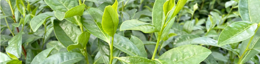
Matcha is like the sad rejected little cousin of coffee in its cafe treatment. Too many establishments overlook this ever-more-popular drink. In a world where 10-30% of customers are ordering matcha at specialty coffee shops, tea might just be the new frontier of specialty cafes.
The anxiety of "is my $8 matcha latte going to be any good" is all too real. It's a minor miracle that there are repeat matcha consumers at all in a current landscape of widely unpredictable matcha quality and top-of-the-market price.

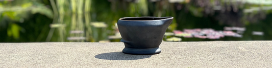
Even at some of the best establishments, there is yet to be a coherent and reliable visual language to separate the mundane from the profound. Matcha tools and preparation in cafes relies heavily on ceremonial equipment that was not built for the job. Tea whisking bowls, bamboo whisks, and scoops are traditionally considered highly prized and precious tea utensils—they were not designed to make 50 matcha lattes a day. It's about time cafe matcha preparation got the specialty treatment.
The ideas and the products being served at specialty cafes is changing. They do not have to be a place where coffee is at the center of the celebration. Tea, in particular matcha, is sharing more and more of the spotlight. A new generation of suppliers is creating a new set of tools unified by a recognizable design language to signal quality and intention.
Our team recorded a podcast about cafe design language, take a listen, links below: